We have a problem. We keep buying books we already own because a new edition dropped with sprayed edges and gold foil and we are WEAK.
Romantasy has the best cover game in publishing right now and it's not even close. The illustration, the metallic detailing, the way cover designers are pulling imagery straight from the story's bones. Some of these covers stopped us mid-scroll. Some of them we bought before reading a single review. A few of them are sitting on our shelf face-out because putting them spine-in felt like a crime.
These are the romantasy covers that made us feel something before we turned a single page.
2,100+ romance books tagged by trope. Filter by spice, genre, and series length. Stack tropes to find exactly what you're craving.
Start Hunting
Daughter of the Moon Goddess by Sue Lynn Tan
The US hardcover of this book. Gold foil for the moon and waves, impossibly detailed cloud-and-flower linework by Kuri Huang, and an ethereal figure gazing upward into a crescent moon filled with intricate shapes. The gold catches light differently depending on the angle, so it photographs like a dream. Every bookstagrammer who's posted this one has gotten the comments: "What book is that??"
And the book holds up. A retelling of Chang'e, the Chinese moon goddess, with a heroine who's hidden her identity her whole life, archery tournaments, an impossible love, and mythology that feels like breathing. Closed door, so the tension lives entirely in stolen glances and near-misses.
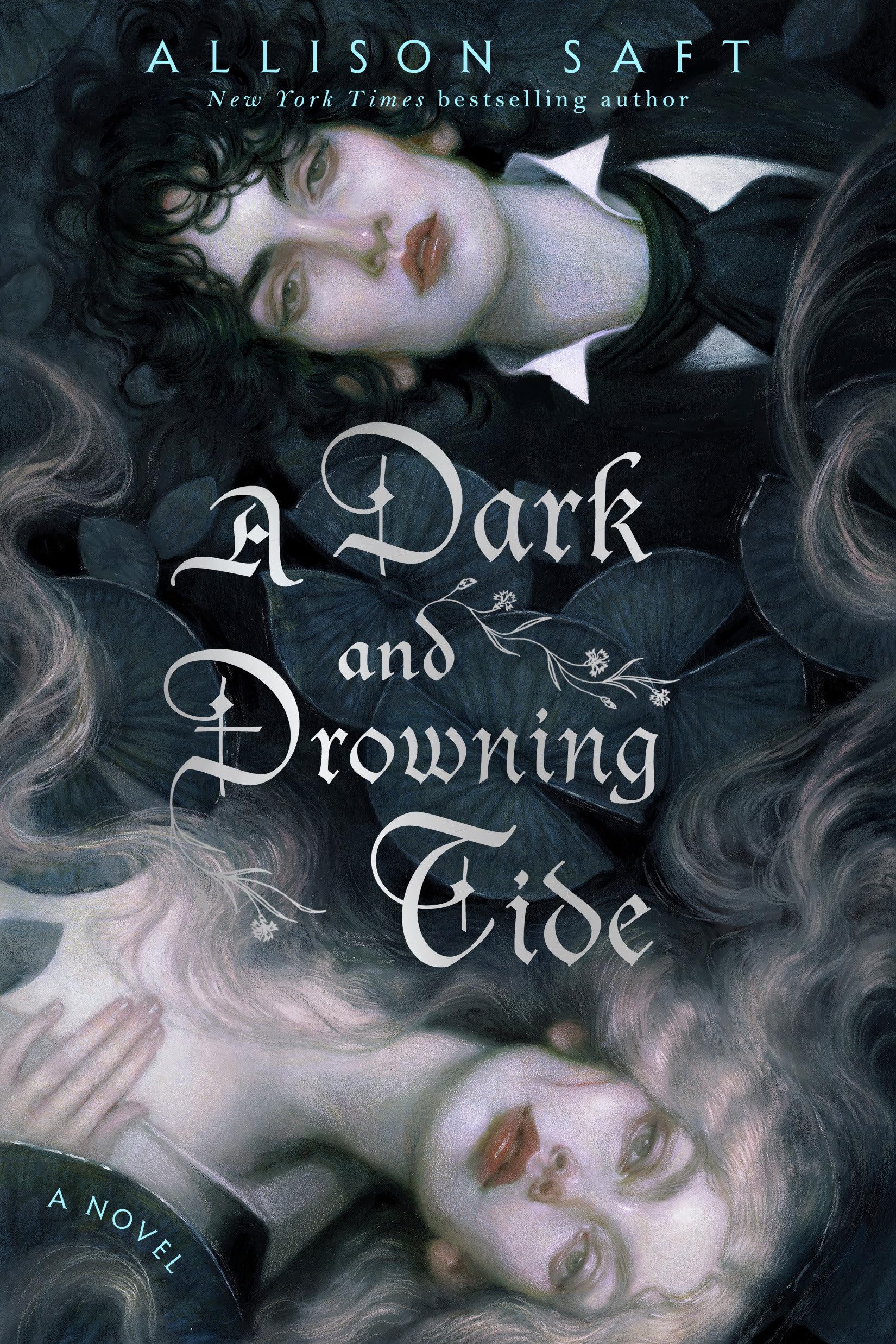
A Dark and Drowning Tide by Allison Saft
Rich blues and greens, two women in a dramatic natural setting, and an atmosphere that feels like standing at the edge of a river right before it pulls you under. The cover art has this painterly quality that most romantasy covers don't attempt. It's moody without being dark, lush without being cluttered. Allison Saft's covers in general deserve a moment (A Fragile Enchantment's pastel textile art is also gorgeous), but this one stopped us cold. A sapphic fantasy romance about rival scholars on an expedition that goes wrong, with enemies-to-lovers tension building across every campsite and river crossing. The cover captures that "beautiful and dangerous" energy perfectly.
House of Salt and Sorrows by Erin A. Craig
Gothic. Underwater. Tentacles woven into the jacket art. This cover is dark and murky in a way that makes you lean in rather than pull back. The Vault 49 artwork captures that Twelve Dancing Princesses retelling vibe perfectly: something beautiful and something wrong, layered on top of each other. The octopus imagery is subtle until you really look, and then it's everywhere. We've stared at this cover for an embarrassing amount of time and keep finding new details. The typography sits inside the design instead of floating on top of it, which is a small choice that makes the whole thing feel like one piece of art.
Gild by Raven Kennedy
The King Midas theme gave the cover designers a gift and they did not waste it. Gold foil dust jacket by @penellope.art. Gold embossed bookcase by @vitkovskaya_art. Digitally sprayed gold edges on all three sides. Gold endpapers. Everything. Is. Gold. And all five books (Gild, Glint, Gleam, Glow, Gold) carry the motif through. Lined up on a shelf, it's a solid wall of metallic warmth. We know someone who bought matching gold bookends for these. Respect.
A King Midas retelling where the "gilded" girl is a prisoner, not a princess. The cover's beauty mirrors the trap. Pretty on the outside, suffocating on the inside.

The Cruel Prince by Holly Black
Pick this book up in a store. Not online. In a store. Because the hardcover has this velvety matte texture that makes it feel alive in your hands. The dark forest imagery, the thorns, the faerie elements lurking in the shadows of the design. The whole Folk of the Air series keeps the same dark jewel-tone palette with crown motifs threaded through, and it looks stunning together. BookTok calls it "the most beautiful book on the shelf" at least once a week and they're not wrong. The cover sells the vibe before you read a word: dangerous, lush, a little bit feral.
Kingdom of the Wicked by Kerri Maniscalco
Megan Cowell did the cover art and poured Sicily into every inch of it. Dark reds and golds, ornate floral borders with demonic elements woven between the petals. The occult imagery matches the story's witch-meets-demon-prince setup without giving anything away. It looks like an artifact from the world inside the book, like someone pulled it off a shelf in a Sicilian witch's library. The whole trilogy keeps this dark Italian aesthetic going, and it's one of those series where we see the spine on someone's shelf and immediately know what it is.

Divine Rivals by Rebecca Ross
War-torn romanticism on a cover. Letters, typewriter motifs, and two figures reaching across something bigger than both of them. The design captures the epistolary heart of this book so well that you can almost feel the weight of the correspondence before you start reading. Both OwlCrate and FairyLoot made special editions, and the FairyLoot version with its sprayed edges and foil treatment sold out in minutes. Collectors are paying double on the resale market and we cannot blame them. The cover tells you exactly what kind of ache you're walking into.

One Dark Window by Rachel Gillig
Lisa Marie Pompilio's cover design pulled people in before anyone had heard of this book. Dark, atmospheric, the kind of cover that makes you pick it up in a bookstore even when you weren't looking for anything. Deluxe hardcover editions (with stenciled edges and bold redesigns) keep raising the bar. The sequel Two Twisted Crowns maintains the same dark cohesion. Both books next to each other look like they belong in the restricted section of a very cursed library. Multiple people have told us they grabbed this based on the cover alone and then were surprised when the book was ALSO incredible.

The Priory of the Orange Tree by Samantha Shannon
800+ pages of epic fantasy with a cover to match. Dragons, warrior women, and illustration work that feels like it belongs on a mural. The sheer physical size of this book makes the cover art hit different. You hold this brick in your hands and the cover wraps around it like a declaration. Orange and gold tones, incredible detail in the scales and armor. Multiple editions exist with different art styles and all of them go hard. This is the cover that made "big book, big cover energy" a thing on our shelves.

Powerless by Lauren Roberts
Ornate sword-and-floral border work with crown and weapon imagery threaded into the title typography. Deep jewel-tone palette. The cover leans hard into the dark romantasy aesthetic and it WORKS. This is one of those covers that drove BookTok discovery. People were posting it before they'd finished chapter one just because it looked so good propped up next to their coffee. The cover says "I'm about to ruin you with a morally grey love interest and I look beautiful doing it." Which, fair.
A Fate Inked in Blood by Danielle L. Jensen
Norse mythology-inspired cover art with runic motifs, bold dramatic warrior imagery, and a color palette that's all deep blues and silvers. It looks cold. In a good way. Like you can feel the Scandinavian wind coming off the jacket. Goodreads voters put this on the "Most Beautiful Covers of 2024" list and we agree. The design doesn't try to be pretty. It tries to be powerful. A shield maiden bound to a Viking warlord, blood magic, and fated mates tension that escalates with every chapter.
Immortal Dark by Tigest Girma
Dark academia meets vampire romance meets cover art that made every gothic fantasy reader sit up straight. Rich, dark tones with architectural elements that feel old and slightly threatening. The design walks a line between elegant and sinister, which is exactly the energy of the book. We picked this up because the cover looked like it belonged in a private collection, and then the story delivered a vampire romance with actual teeth (figuratively AND literally). Dark doesn't have to mean boring, and this cover proves it.
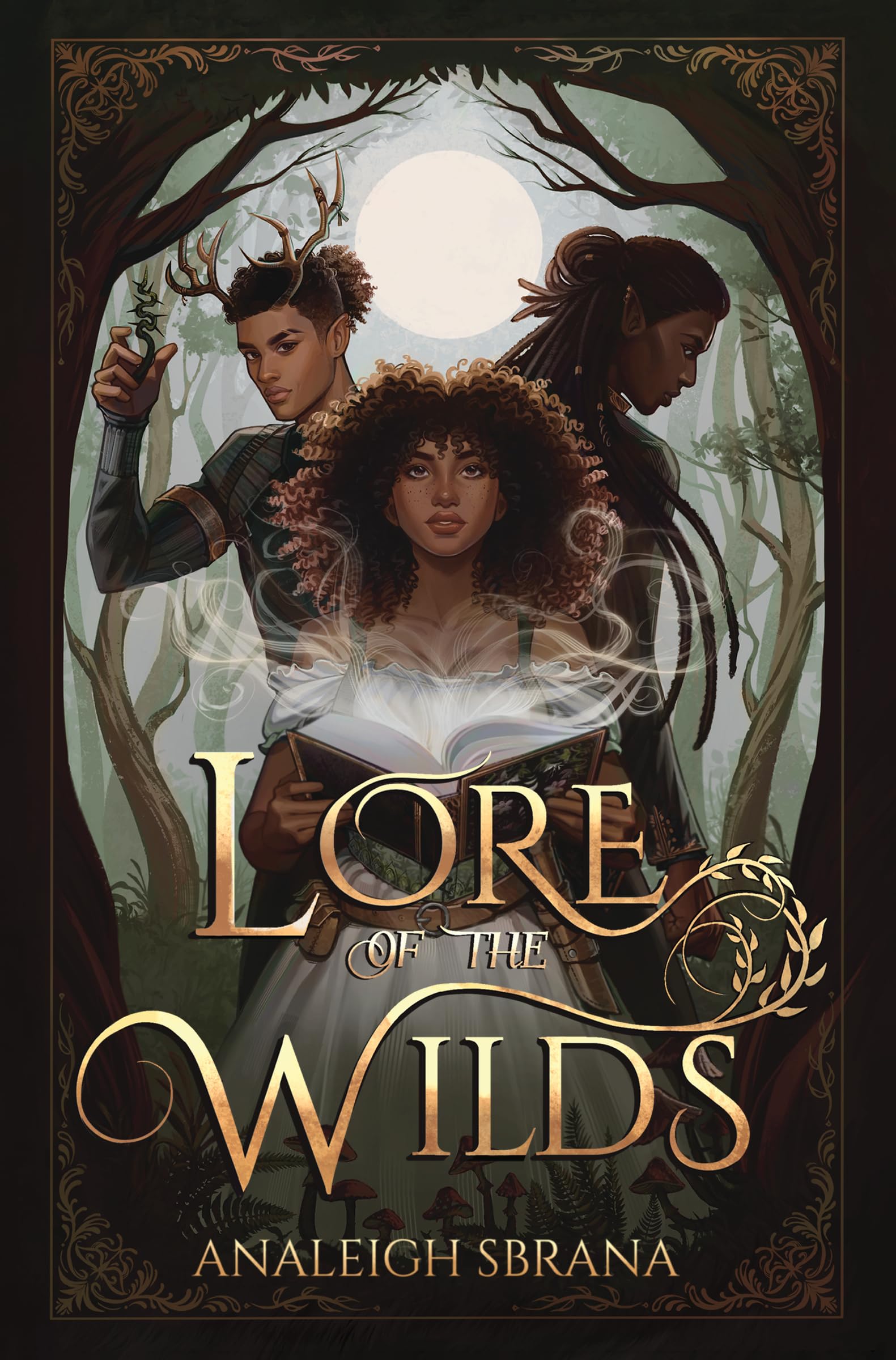
Lore of the Wilds by Analeigh Sbrana
Enchanted library vibes on a cover. Lush greens and golds, Fae imagery intertwined with books and magic. The illustration has this warmth to it that pulls you in, like stepping through a doorway into somewhere you're not supposed to be (but definitely want to stay). This debut landed on multiple "most beautiful covers" lists in 2024, and it earned every spot. A human woman. A forbidden Fae library. A book of dangerous magic. The cover tells you all of this without a single word of copy.
The Spellshop by Sarah Beth Durst
Every other cover on this list is dark and moody and dramatic. And then there's The Spellshop, radiating cottagecore energy so hard it practically smells like fresh bread. Soft pastels, a cozy cottage drowning in greenery, and an adorable winged cat creature front and center. Book Riot called this out as a standout romantasy cover, and we get it. A librarian smuggling banned spell books to a remote island, a grumpy-sunshine love interest, and a magical garden that solves problems. Comfort reading with a cover to match.

Sorcery of Thorns by Margaret Rogerson
A girl standing before a massive enchanted book that's coming alive with magic, thorny vines crawling up the spine, and a color palette of deep blues and golds that looks like it belongs in the restricted section of a library you'd break into at midnight. This cover tells you everything you need to know: books are alive here, they're dangerous, and this girl is going to fight one. Margaret Rogerson's covers are consistently gorgeous (An Enchantment of Ravens is also beautiful), but Sorcery of Thorns is the one that stops people in bookstores. We've seen it face-out in every indie bookshop we've walked into for three years running. The cover has done more for this book's sales than any marketing campaign ever could.
The Special Edition Game
We can't do a cover post without acknowledging the elephant on the shelf: special editions have completely changed how romantasy looks. FairyLoot, Illumicrate, OwlCrate, LitJoy Crate, Fablelistik. They're commissioning original cover art, sprayed edges in jewel tones, foil stamps, custom endpapers. Books that already looked good in their standard editions get the collector's treatment and become objects.
A few that deserve a nod for their special edition glow-ups:
A Court of Thorns and Roses by Sarah J. Maas
The Bloomsbury collector's edition with gilt designs and a black slipcase. The B&N Night Court Edition with black-and-silver foil and black sprayed edges. The Juniper Books set with starlit sky custom jackets. Every single one sells out. We've lost count of how many editions exist at this point.
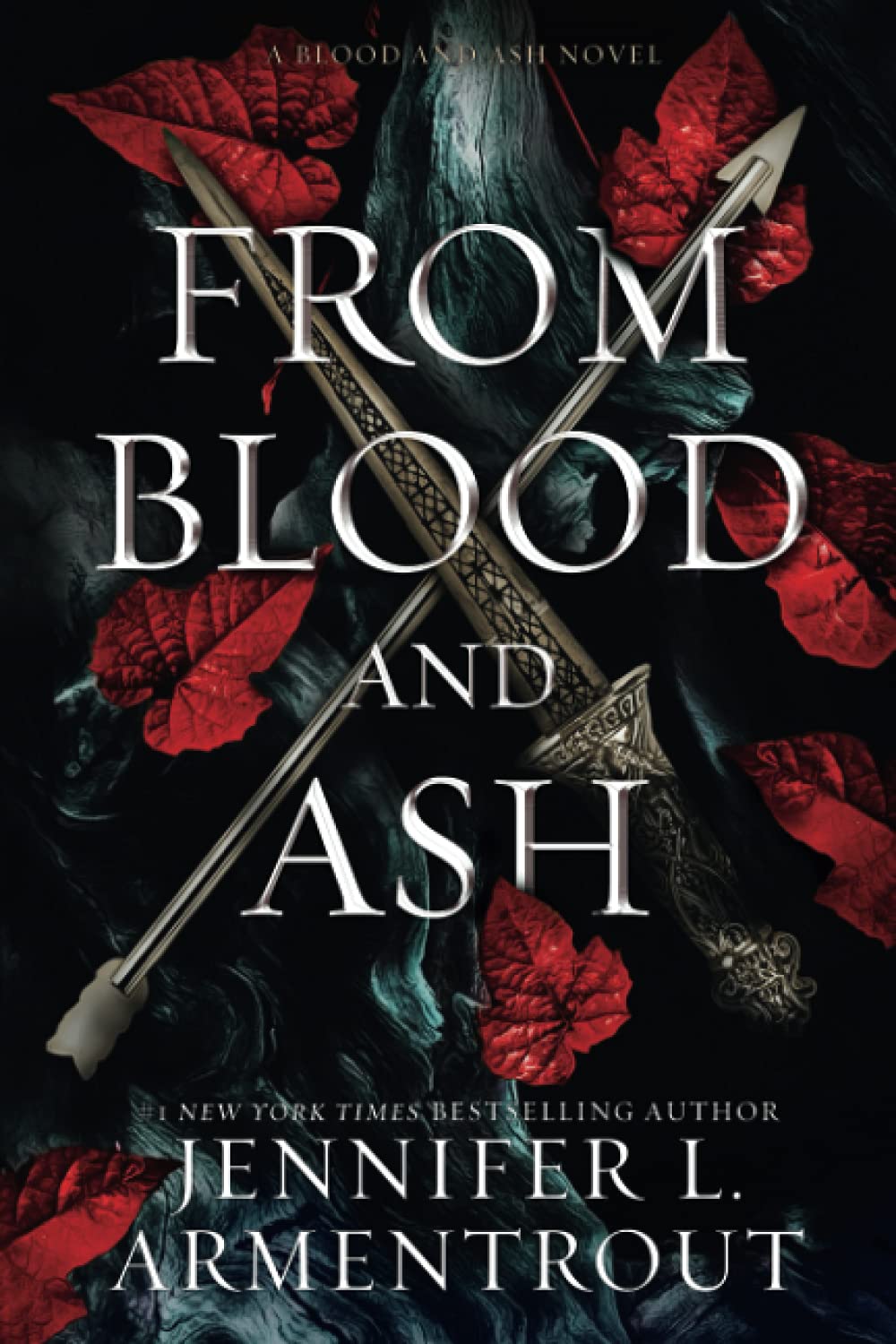
From Blood and Ash by Jennifer L. Armentrout
Micaela Alcaino's redesigned special editions are some of the most striking in the genre. Ornate crowns, weapons, and floral borders in deep jewel tones. The FairyLoot deluxe set with completely new cover art and sprayed edges turned a popular series into a collector's obsession.
The Serpent and the Wings of Night by Carissa Broadbent
The Bramble/Tor release with brand-new case art and a detailed Obitraes map. This book went from a beloved self-pub to one of the most collected editions in romantasy. The dark, moody vampire-fantasy cover design got even better with a traditional publishing budget behind it.
Bride by Ali Hazelwood
The Illumicrate Afterlight Exclusive with red foil, custom edge art, and custom endsheets. Leni Kauffman's original cover was already a conversation piece. The collector's edition turned it into a shelf centerpiece.
The design trend right now is moving toward hand-painted artwork with fine-art textures, pushing back against the era of generic digital covers. Romantasy readers can tell. And they're buying accordingly. A gorgeous cover won't save a bad book, but it'll get a good book into hands that might not have found it otherwise. Plus, our shelves look incredible.
Tell us what you love and what you avoid. Every book gets scored: how much of what you love is in it, and whether anything you avoid is hiding inside.
Create My Profile